
What are you more likely to read: a lengthy text article or an infographic on the same subject? It’s most probably going to be the latter.
That’s the power of infographics. In this article, you’ll learn about the 8 types of infographics that B2B marketers can use.
That’s the power of infographics.
Infographics are a visual representation of information or data. They comprise visual elements such as illustrations, graphs and charts along with minimal text.
They capture attention and keep readers engaged while conveying information in a manner that’s easy to scan and digest.
The Role of Infographics in B2B Marketing
B2B marketing is often perceived to be dry and boring but it doesn’t have to be that way. With depleting attention spans and information overload, what helps is creating content that breaks through the clutter.
Infographics can help you achieve that. As per a study, 65% of B2B marketers use infographics for content marketing purposes.
Apart from being attention-grabbing, infographics receive 3x more shares than any other type of content and are known to increase website traffic by 12%.
8 Types of Infographics You Should be Using for B2B Marketing
From providing an overview of a topic and explaining a long-drawn process to summarizing important points and comparing multiple options — there are various ways to use infographics to create awareness and educate your customers.
Let’s take a look at the eight types of infographics you can use to market your B2B brand.
1. Informational
Informational infographics are used to explain concepts or give a broad overview of a subject. They are heavier on the text as compared to the other infographics.
Informational infographics are usually broken down into several sections, each of which comprises a subheading, illustrations and text to convey the information.
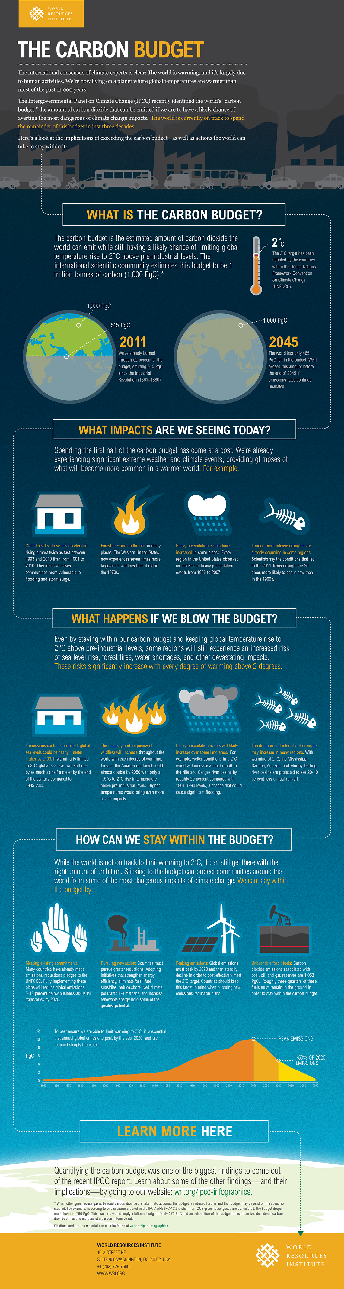
Here’s an example of an informational infographic by the World Resources Institute on The Carbon Budget.
Notice how they’ve broken down a complex subject into smaller, digestible parts and have used illustrations and crisp copy to tell a compelling story that manages to keep the reader hooked.
2. Timeline
Do you want to share historical data, highlight milestone events or take the readers through the evolution of a brand? Timeline infographics are perfect for these purposes.
They are typically used to tell a story in a chronological or linear manner. Instead of writing out the dates and overwhelming readers, timeline infographics let you plot them visually and communicate information quickly.
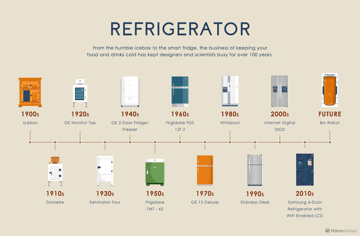
Take a look at this example of a timeline infographic by Home Advisor. Would the same be easy to read and retain if it were written in the form of an article? Not quite. Owing to the timeline format, you’re able to process this information with greater ease.
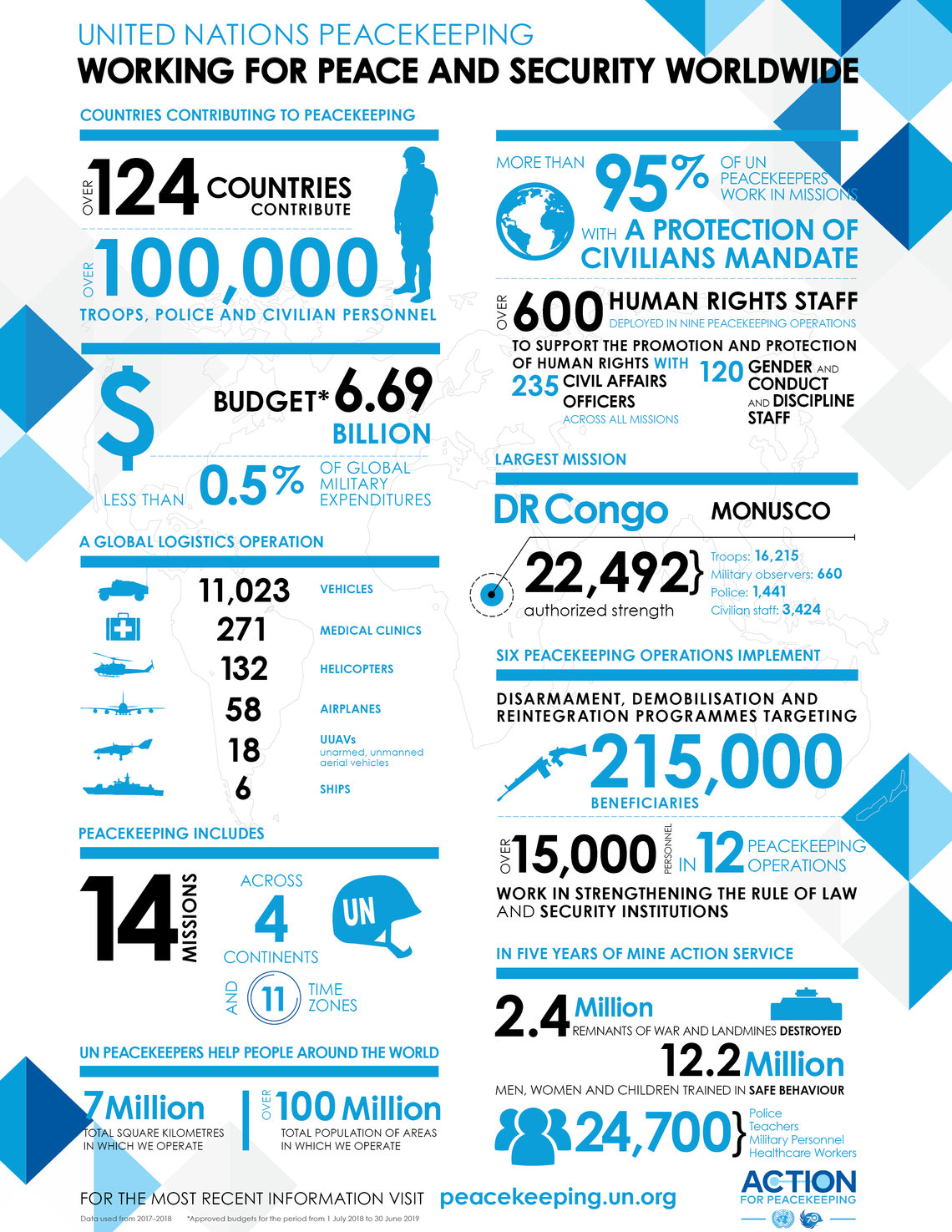
3. Statistical
From drawing attention and persuading readers to inciting action — numbers make for powerful marketing tools because they have a psychological impact on people.
But how do you present numbers without intimidating readers? Enter statistical infographics.
Statistical infographics are a good way to visualize data and present them in an appealing manner. This type of infographic makes use of graphs and charts to deliver a compelling story with numbers.
You can use statistical infographics to share survey data, present research findings or to back your arguments up.
Here’s an interesting statistical infographic by United Nations Peacekeeping.

4. Process
Let’s say you want to take your audience through the various steps or procedures in a process. At such times, it helps to use a process infographic to communicate that information.
You can use color-coding and design elements such as arrows and lines to make the process infographic easier to grasp. It’s also a good idea to number the processes to guide the reader’s gaze.
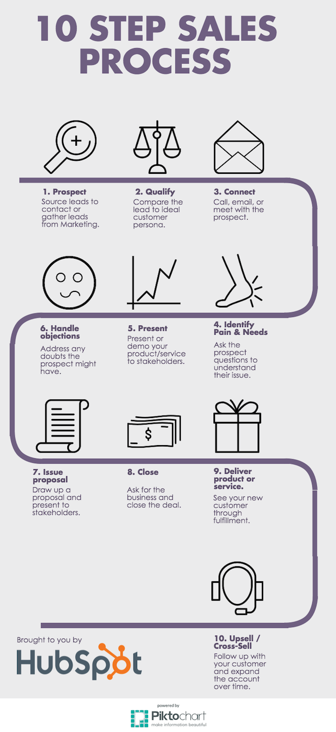
Here’s an example of a process infographic by HubSpot where it clearly outlines the different steps in a sales process.
5. Map
Map or geographic infographics are used to visualize and present location-based data. You can use them to highlight regional patterns, show demographic data, pinpoint your target market, track population growth or even draw comparisons between multiple regions.
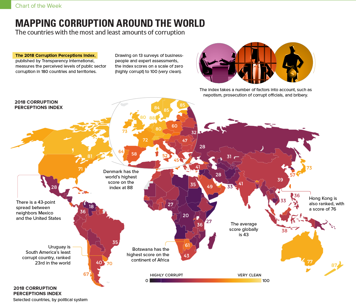
Take a look at this map infographic by Visual Capitalist which visualizes corruption around the world.
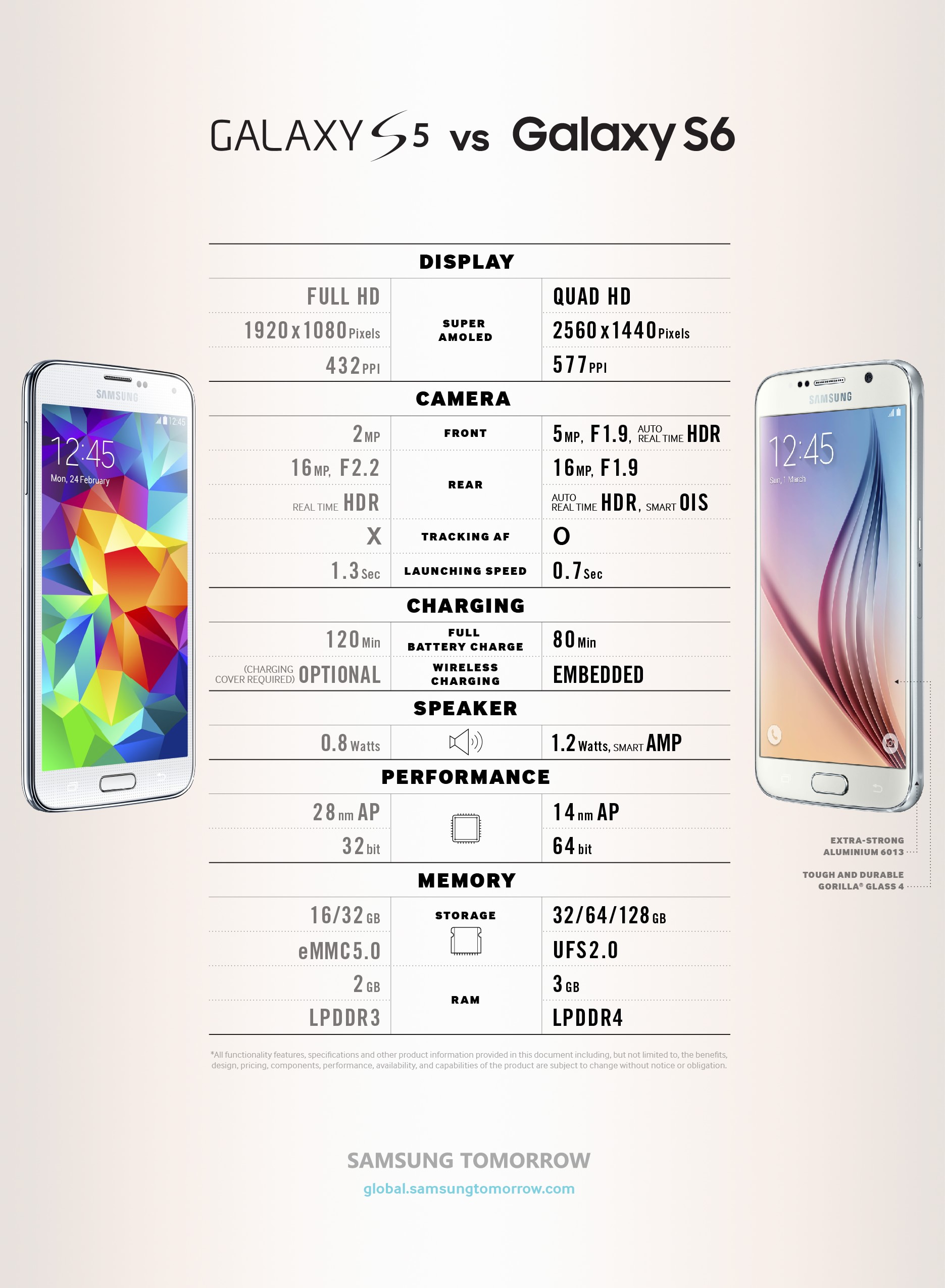
6. Comparison
Have there been times when you’ve had to compare products, services or pricing packages? The best way to present that comparison is by using a comparison infographic.
This type of infographic lets you draw comparisons using illustrations while helping people make informed decisions. All you have to do is list each of their features or benefits and use icons or illustrations to present that information visually.
Here’s an example of a comparison infographic by Samsung that does a quick spec comparison between their phones, GalaxyS5 and Galaxy S6. One look at it is enough to understand the difference between the two, helping readers come to a decision quickly.
Free B2B Content Strategy Template
Not sure where to start when it comes to your content strategy? Struggling to gain traction? Grab our free B2B content strategy template to help you document your strategy.
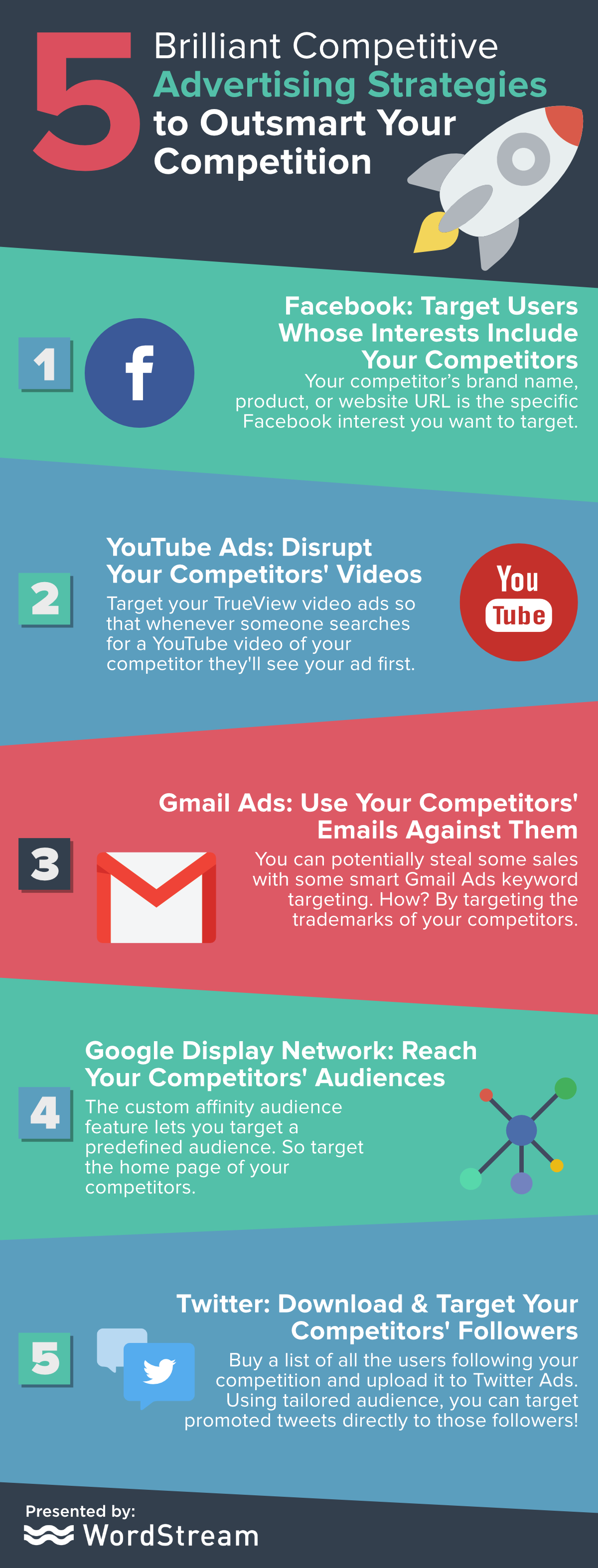
7. List
As the name suggests, list infographics are great for listing, summarizing or highlighting points. You can use list infographics to share quick tips or summarize a long blog post, bringing out the important points in the article.
You can use icons and illustrations to complement the text and make for a more engaging read.
Here’s an example of a list infographic by WordStream on advertising strategies to outsmart your competition. Notice how laying this information out on an infographic makes it so easy to grasp.
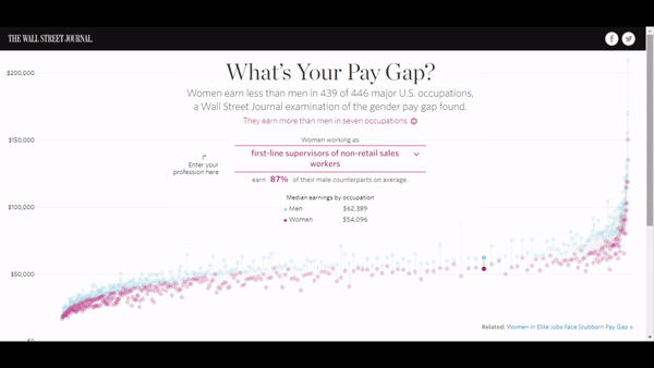
8. Interactive
Interactive content receives two times more engagement than static content, making it a must-have in your content marketing arsenal.
The good news is that infographics can be interactive too.
Interactive infographics encourage users to participate, helping them discover information on their own. They can view the infographic on the basis of the answers or options they select.
You can use interactive infographics when you have a lot of information to share or want people to take their own path with the information.
Here’s an interesting interactive infographic by the Wall Street Journal that talks about the gender pay gap. It lets you enter your profession and calculate how much women make compared to men.

Conclusion
It’s a noisy world. The only way to stand out and differentiate yourself from your competitors is by creating content that captures attention and engages the audience. Infographics are one such type of content.
So, move beyond wordy articles — think visually and use infographics in your landing pages, blog posts, case studies, email marketing newsletters and social media posts. This will help you create awareness, attract traffic and generate quality leads in the process.
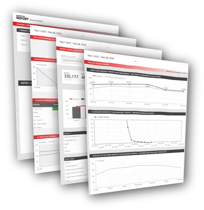
Free DataStudio Marketing Report
Improve your marketing reporting with our free DataStudio template that pulls data from Analytics, Google Ads, and Search Console to get a 360 degree view of your digital performance.
Marcus Ho is the founder and Managing Director of Brew Interactive, an award‑winning B2B digital‑marketing agency that helps organisations transform their sales and marketing processes in the Asia‑Pacific region. With a career spanning over a decade in digital, he has led strategies for global brands such as Hitachi, Bosch, and 3M, focusing on data‑driven campaigns and go‑to‑market acceleration.
